There’s brand consistency, and there’s brand monotony.
Weil is a storied law firm with a rich history, but they felt the expression within the current visual system was getting stale. I joined them for six months to bend their existing visual system through a different lens.

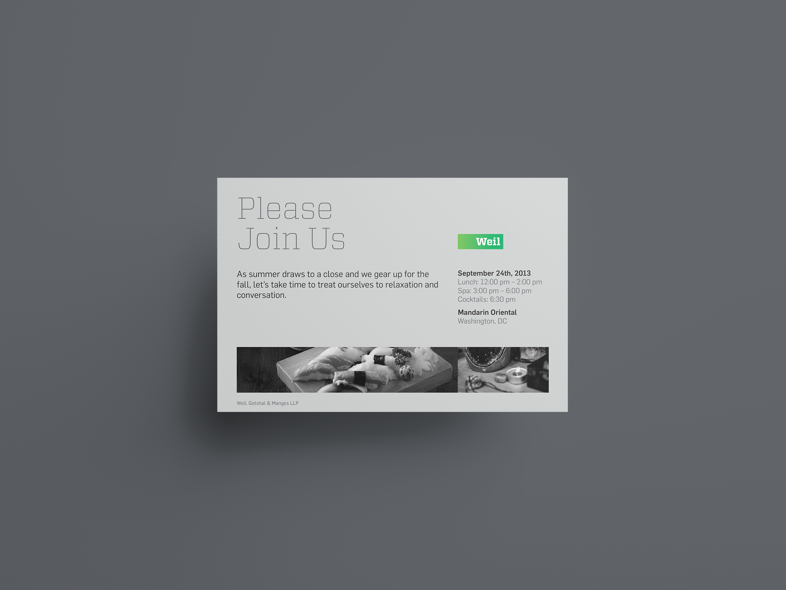
Movie prescreening events were an ideal opportunity for me to experiment.
Because these events were both ephemeral and casual — guests included client families and friends — I coaxed Weil to relax its corporate nature and have a bit of fun developing mini-identities for the invitations, tickets, digital communications, and environmental graphics.
Then to elevate these experiences, I developed branded snacks, drinks, and giveaways for each movie.


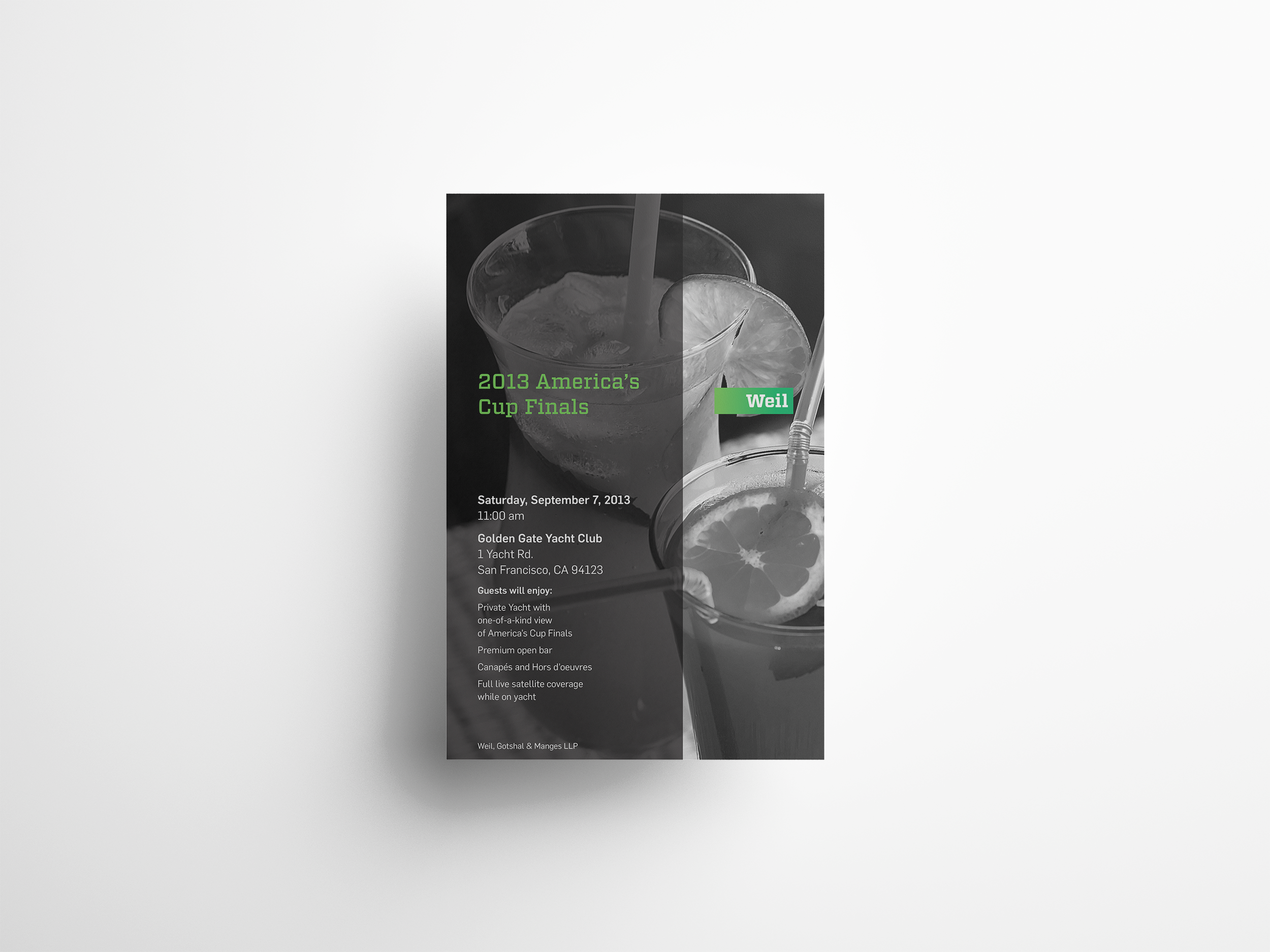
I focused one brand expression on transparency and typography.
In reimagining Weil’s visual identity, I wanted to minimize massive expanses of black that had become a visual crutch. Instead, I designed communications that were bright, green, and airy – using black only as an occasional accent. Additionally, I alluded to the firm’s complex legal navigations by layering and windowing large typography.


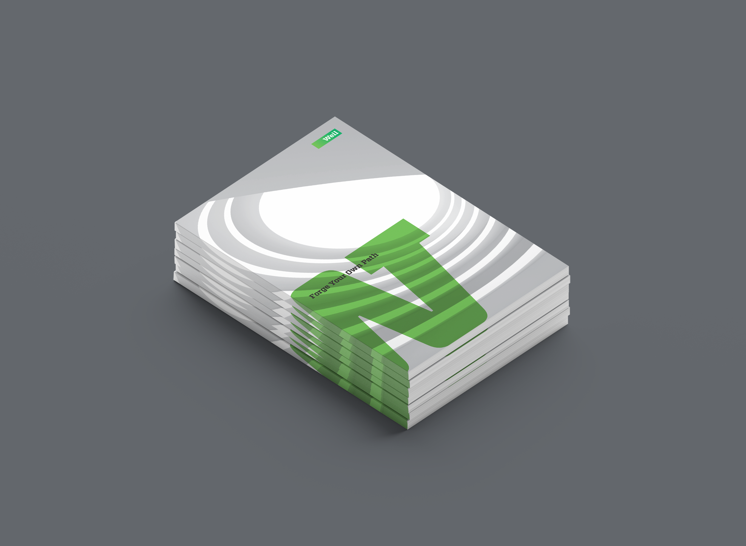
I took advantage of new on-demand printing technology in a second expression.
Weil’s photography style was strictly black-and-white. Traditional press printing required long runs for metallic inks, but newer innovations lowered the cost of entry. I used this new technology to augment the black-and-white photography with metallic ink plates. The new photographs and pages would literally sparkle, allowing traditional print pieces to interact with the light and environment around them.