To grow, Sio Beauty needed to extend its brand into the male market.
While Sio’s wrinkle reduction patches were essentially remaining the same, men were not reacting to its existing brand or packaging.
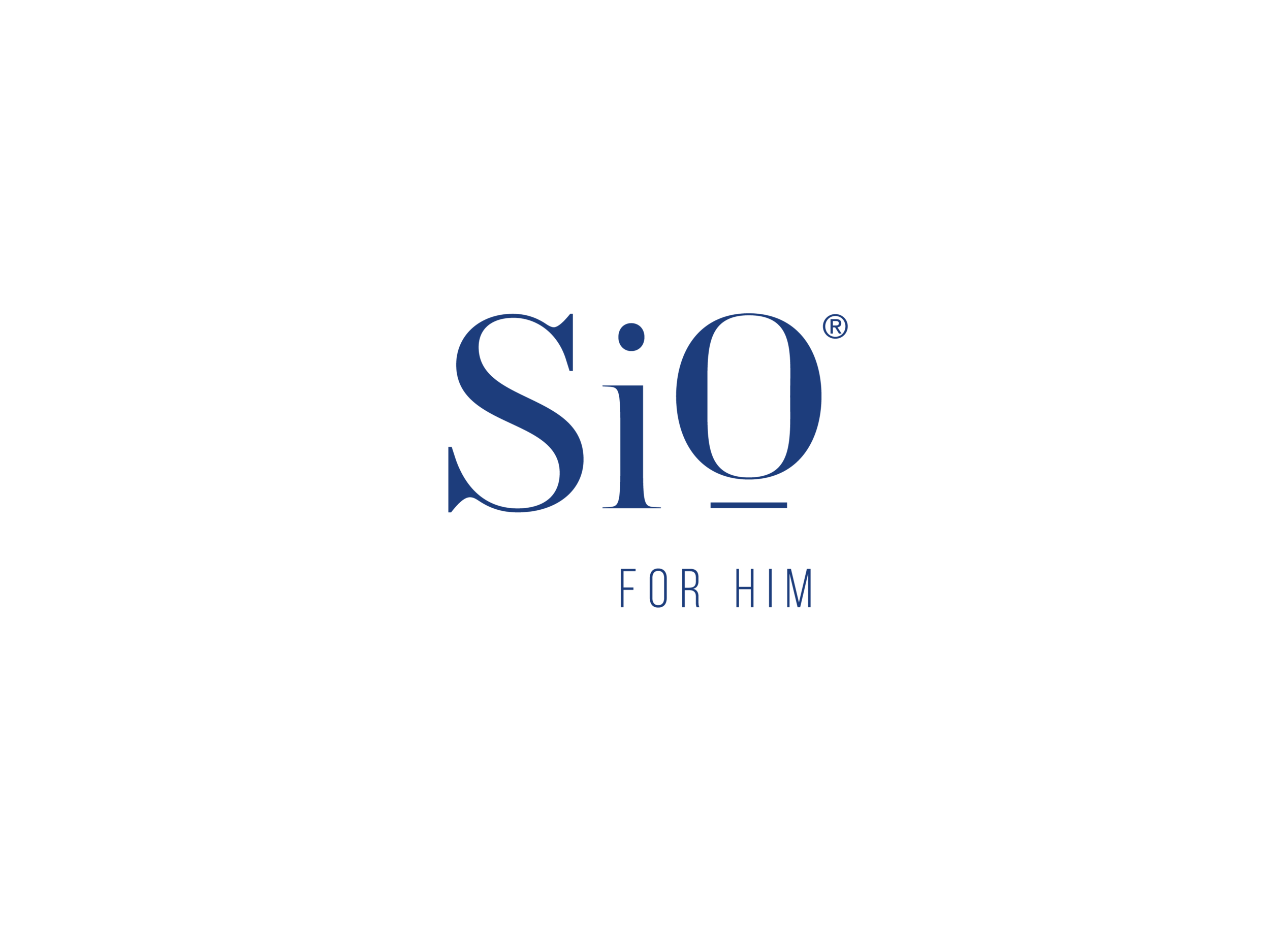
To remedy this, I developed a sibling brand called Sio for Him. I began by expanding the color story. Introducing navy and favoring the existing deep teal gives the packaging a masculine look while still complementing classic Sio Beauty. I then modified the logotype by removing the water droplet and typesetting in navy. These slight shifts allowed both brands to feel related without diluting one another.
I then used the updated visual identity to create packaging that reflected the appropriate balance between navy and the rest of the color story.