
Process
Challenge
Can I develop a product compelling enough to break into an already saturated market?
Initial Research
What might users pay for? What’s the state of the market?
Stories, Personas, and Journeys
Who are my users? What are they trying to accomplish?
Tasks and Information Architecture
How can I guide users toward the solutions they need?
Wireframing
What goes where? What do you think of these features?
Prototype Testing
What’s working and why? But really, what do you think of these features?
Retrospective
How did everything go?
Challenge
Can I develop a product compelling enough to break into an already saturated market?
As part of my UX design coursework, I developed Zephyr, a responsive web app delivering specific weather data to water and wind sport enthusiasts including surfers, scuba divers, kayakers — anyone who enjoys outdoor activities in, on, or around the water.
My work began with a business model hypothesis to test: because this audience already invests in certifications and equipment to enjoy their sports, compelling features could convert users into app subscribers despite free alternatives being available.
Project at a Glance
UX designer role with light UI and visual brand developement
4 month timeline in 2023
CareerFoundry coursework with additional post-certificate iteration

Meet Poncho.
And his human, Juan.
You’ll get to know them in a bit.
Initial Research
What might users pay for?
Both user interviews and competition analysis would be essential to test my hypothesis that a subscription model was viable and understand the market more broadly.
My social circle included several potential users, and three agreed to hour-long user interviews. Our interviews focused on the specific needs for their sports, the competitors they used, any friction points, and finally, what apps they paid for and why.
I was surprised to learn that participants did nearly all of this planning on their phones. I would have done this planning on a desktop, so it was an important lesson not to project my own preferences onto users at large.
Crucially though, all interviewees subscribed or intended to subscribe to Windy.com, confirming my first hypothesis.
Techniques at a Glance
User Interview qualitative research
Affinity Mapping research synthesis
Insight Articulation research synthesis
Competition Analysis
Software at a Glance
Zoom for interviews
iOS for native mobile app analysis
Safari for mobile browser and desktop experience analyses
Chrome for desktop experience analysis
InDesign for presentations


What’s the state of the market?
The interviewees’ frustrations quickly became apparent when I analyzed competitors Windy.com and SailFlow. While these platforms had every type of weather data imaginable, users had to hunt for it in interfaces with many levels of hierarchy.


Stories, Personas, and Journeys
Who are my users? What are they trying to accomplish?
Before I could ideate flagship features, I needed to write user stories, define personas, and explore the journeys they might experience throughout a typical week.
These personas and their journeys represented the two major buckets of users that emerged during my initial research. Juan represents people with the flexibility to go out at a moment’s notice, while Jason represents a traveler or weekend warrior whose activities involved more planning.
Techniques at a Glance
User stories for three audience groups
User personas for two audience groups
User journeys for each persona
Software at a Glance
Photoshop for user personas
InDesign for personas and presentations


Tasks and Information Architecture
How can I guide users toward the solutions they need?
With personas and journeys defined, it came time to establish the information architecture and user flows that would guide users through those journeys and solve their problems along the way.
To kick things off, I put my first site map through open card sort testing to see how potential users clustered the information and pages. Information architecture was the first major challenge I faced as my initial site map changed to address quirks in user flows, and then vice versa. This tweaking of the architecture continued not just through prototyping but through to this very day.
Techniques at a Glance
Task analysis for personas
User flows for personas
Open card sort user research
Software at a Glance
OptimalSort for card sorting research
Figma for site mapping and user flows
InDesign for presentations


Wireframing
What goes where?
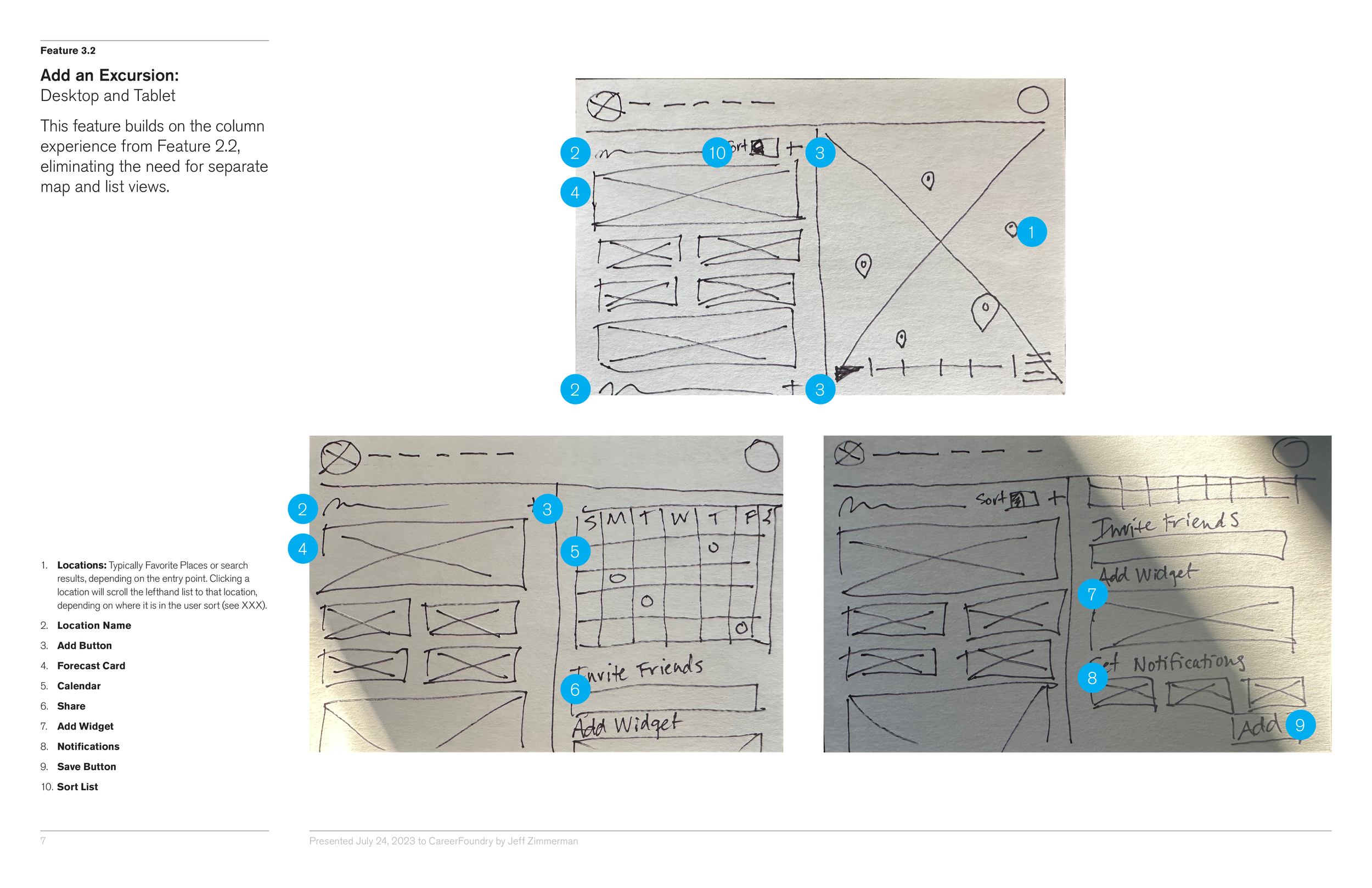
Armed with my user research to date, it was now time to start wireframing the mobile experience. Despite focusing my efforts on mobile, I was considering how to extend this experience to the desktop and landed on a combined grid system.
I structured the main app based on a 4-column grid for mobile that would expand to 12 on the desktop, and the customized forecast layouts would be based on a modular grid with 3 sizes of weather data tiles.
Techniques at a Glance
Pen-and-paper for low-fidelity wireframes
Figma for mid-fidelity wireframes and clickable prototypes
InDesign for presentations


What do you think of these features?
With an underlying structure established, I crafted three flagship feature experiences. Not only did I want to create the features, I also wanted to tee up questions I could ask users in testing. Not just a traditional prototype test, but a follow-up to my initial research.
This was one of the most interesting facets of the process. As I was working on layouts, I began to understand the push-and-pull between elements of the experience, seeing how each added complexity to the system and intuiting when users might get overloaded.


Prototype Testing
What’s working and why?
With the wireframe prototypes established, it came time to test. However, this testing phase had two goals. In addition to testing the experience itself, I wanted to do some user interview qualitative research about specific features. The testing included prototypes addressing these three scenarios:
The experience testing led to changes throughout the app as shown in the images below.
Techniques at a Glance
User Interview qualitative research
Affinity Mapping research synthesis
Rainbow Spreadsheet error synthesis
Software at a Glance
Zoom for recorded interviews
Figma for clickable prototypes
InDesign for presentations


But really, what do you think of these features?
Hearing from the end audience/consumers is something I’d really been missing in my design practice, making this qualitative research about my feature ideas the most rewarding portion of this development process. Users were genuinely excited about the features I had developed as they felt the features solved their problems, particularly the customizable forecast layouts. More importantly, participants were excited to brainstorm ways to build upon these ideas.


Retrospective
How did everything go?
Working on this project made me really excited for this new career step I’m taking. I really enjoyed getting feedback during the research phases and being able to root decisions in data rather than hunches and intuitions—though I did learn my intuitions are pretty good!
Overall, my end product feels like a better version of my original vision. The changes definitely improve the experience, but I got a great deal right from the beginning thanks to the efforts I made to understand the market and potential users.
Project at a Glance
UX designer role with light UI and visual brand developement
4 month timeline in 2023
CareerFoundry coursework with additional post-certificate iteration